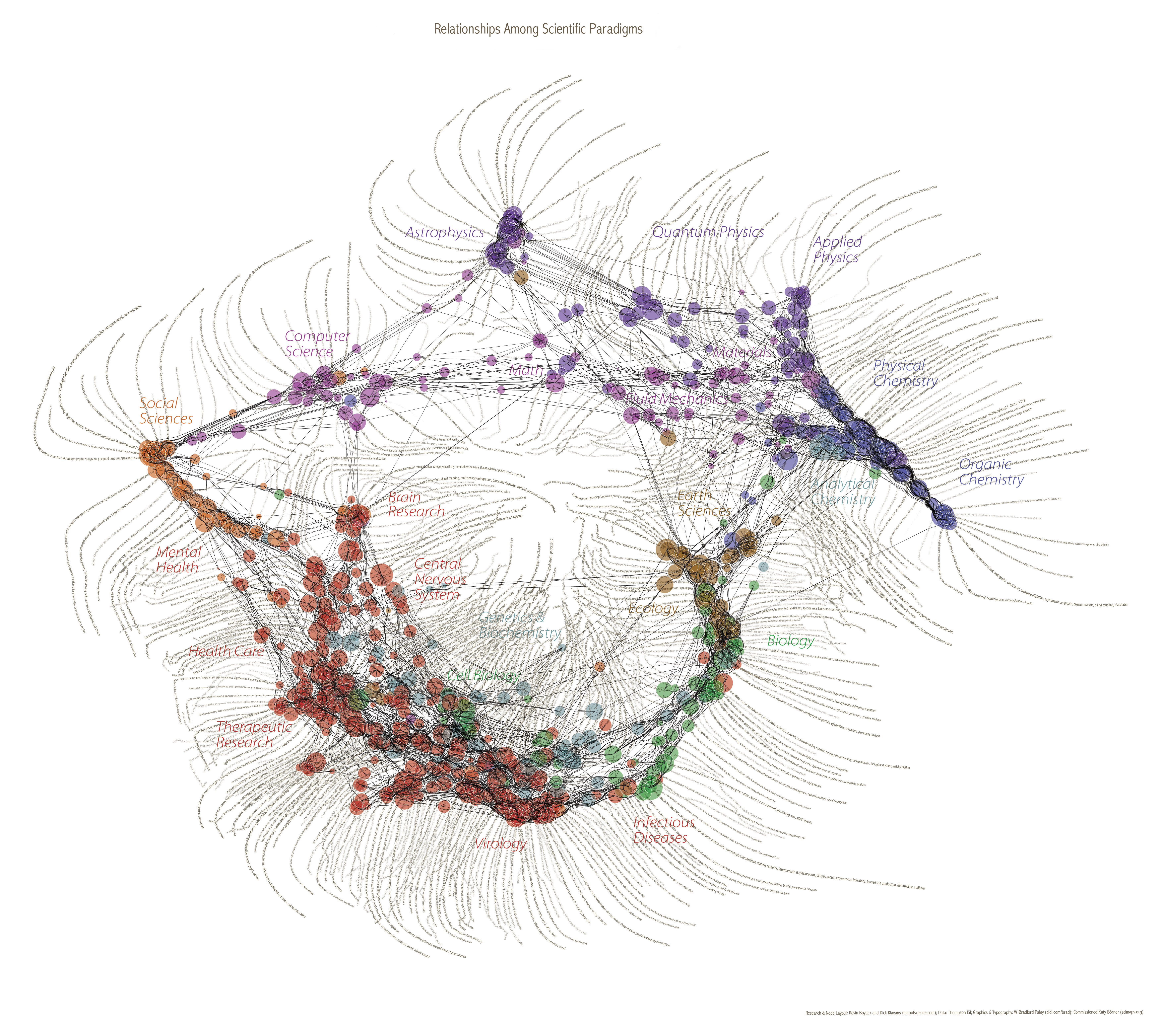
Map of Science
Ay ay ay, it can be hard to update. Hard, hard work... but here it is... an update.
The grand MAP OF SCIENCE!!
"As to what the image depicts, it was constructed by sorting roughly 800,000 scientific papers (shown as white dots) into 776 different scientific paradigms (red circular nodes) based on how often the papers were cited together by authors of other papers." LINK to a very nice article about it.
I like it so much when dry and hard science turns out to create the most intriguingly (my favorite word on this blog) beautiful visuals. There is a certain bit of ostranenie - estrangement in it.
The reason it looks like a feather boa is that from every node runs a line of key-words. HERE you'll find a huge version where you can read the words. And HERE is the most beautiful version of it - where you can buy a rather huge print of it too.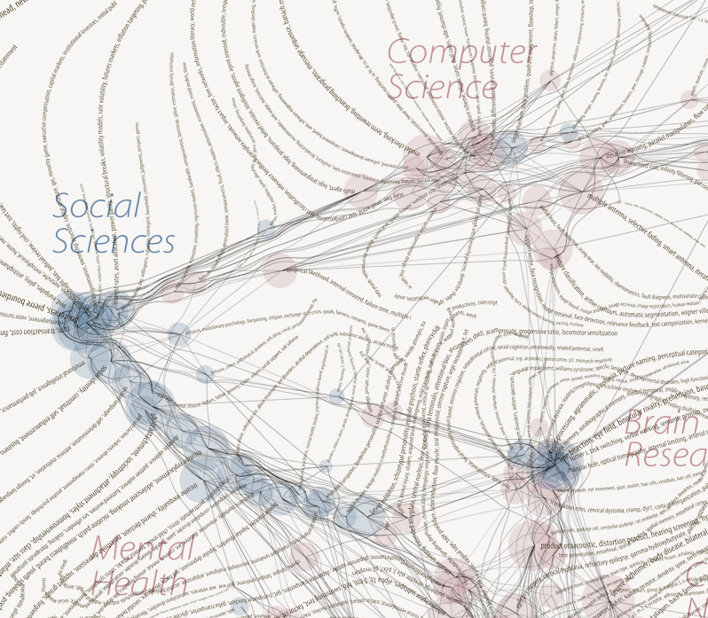
The image was constructed by Kevin Boyack and Dick Klavans. On their site mapofscience.com you'll find a simpler interactive version of the map that describes the idea and possible uses very well.
It is not a map of science, in essence. It's a map of text. In this case from a particular database of scientific papers. And therefore 'social science' is the blue worm in the extreme left of the diagram. Political science completely absent. Economics. Law. Philosophy. Litterature, poetry, drama. Could be nice to try the same on those. A virtual mental map of humanity. Which scaled down on the screen of the computer begin to again resemble a written sign.
With these words I'll ride into the night. Celebrating first of all that I got my first paycheck today. And secondly that I work for a city that has been run by social democrats for 100 years and therefore I have the day off tomorrow. I wish you all happy international worker solidarity.
![]()


No comments:
Post a Comment