Mar 31, 2009

Some Sight


Augusta Atla posted this picture of a Robert Smithson (check, check, check) None-site. I like Smithson very much and the idea of the Non-site:

'The Non-site (and indoor earthwork) is a three dimensional logical picture that is bstract, yet it represents an actual site in NJ (The ine Barrens Plain). It is by this three dimensional metaphor that one site can represent another site which does not resemble it - thus the non-site'
Robert Smithson, 'The Collected Writings', p. 364

But looking at it this time, I got the feeling that I'd be much more interested in the surrounding information and documentation. About the actual place and proces. Though Smithson defines the Non-site as a 'three dimensional' 'metaphor' which 'does not resemble' the place it represents, he has not kept from adding that other layer. And that is the part I suppose I would dwell by the longest. Explore and dig out facts about the site and background. And perhaps create a world of my own. Which is something I don't feel the Non-site allows or invites me to do.

Someone who've done something like this is Christoph Niemann - an illustrator who blogs - Abstract City - for NYT. Here's how he introduces I Lego NY:
'During the cold and dark Berlin winter days, I spend a lot of time with my boys in their room. And as I look at the toys scattered on the floor, my mind inevitably wanders back to New York.'

I think there's quite a bit of Non-site in that. But what he does is more like the detailed documentation hanging next to (and is part of, of course) Smithsons piece. He takes known and less known characteristivs of New York, and describes them in Lego, through different types of representation:

Some are practical and instructional:


Elevations:


Diorama depicting a specific situation


Wellknown phenomenon:


Unlikely juxtapositions of scale and subject:


It's brilliant I think - see the rest. He lights his subject from numerous different angles. Which reminded me of something I read by Edward Tufte recently ... actually I think he said it in his review of the iPhone (worth watching):

'To clarify - add detail'

Of course - clarification might not be the goal exactly, but I like the principle. Tufte is the great guru of infographics, and I've been following some of his different advice lately. His website can be labyrinthic to explore, but is full of interesting stuff focusing on the visualiation of information. Fx. this piece about image annotation, consequenty used with the above pictures.

Mar 22, 2009

NBG

Mar 11, 2009

Brown Snow


The Greenlandic language (both of them?) is popularly known to contain 83 words for snow. It's a lesser known fact that in Danish you find just about as many words defining particular qualities of wet brown stuff on the ground. Sjap, sjask, smat, pludder, mudder, pløre, ælte...


Urban Communication


... I think our dear municipality is trying to tell us something here ... hmm ... it makes me wonder what proces has gone before this particular piece of urban design.

It's part of the, let's say, partially succesful and hugely debated redesign of Nørrebrogade - a major Copenhagen street.

Mar 5, 2009

Return Of The King


February, when wet heavy snow covered the city for unusually long. The Kings Garden in the center of Copenhagen. The sky looked like that 8 h. 22 min. that day. Then it got dark again. My friend The Bicycle Thief - a film reference, not an occupation. A mental state perhaps.

Testing, Testing, One, Two


Juuust testing out how blogging from iPhone works.... endless new possibilities...

Sep 19, 2008

blublu


Off to the Biennale in Venice tomorrow morning, early, early. So here's just for your pleasure a fantastic street art animation by Blu:


MUTO a wall-painted animation by BLU from blu on Vimeo. ... and I must remember to thank Mauro for the tip :) BLU is definately a new favorite.

For more on street art go to - I think - the web's top blog in that field: woostercollective.com

Sep 9, 2008

Beyond Architecture


M FUKSAS D

As I'll be going to the Architectural Biennale in Venice in a few weeks
I was checking up on this years theme... and... I was very happily surprised:

Out There: Architecture Beyond Building, points out what should be an obvious fact: architecture is not building. Buildings are objects and the act of building leads to such objects, but architecture is something else. It is the way we think and talk about buildings, how we represent them, how we build them. This is architecture. More generally, architecture is a way of representing, shaping and perhaps even offering critical alternatives to the human-made environment.

Reading this brought me back to my first day at The Royal Danish Academy of Fine Art's School of Architecture. Specifically it brought me back to the very moment the introductory lecture peaked. Thit happened when the lecturer came to the rhetorical question "what is architecture?". Insterestingly it turns out that architecture is defined by just three, very precise, parameters:

1 ARCHITECTURE IS TIED TO A PLACE

2 ARCHITECTURE IS LIMITED BY IT'S OWN MATERIALITY

3 ARCHITECTURE IS ... SOMETHING ... SOMETHING ... WHITE CARDBOARD
... unfortunately I have long forgotten that third parameter, but I feel I'm not that far off with white cardboard. What I find striking about this definition - and so overwhelmingly opposed by the theme of the Biennale - is how static it is. "Tied" and "limited". Reducing the role of architecture to a physical object. Excluding anything mobile or anything virtual. Denying the existence of time.


Erik Adigard / M-A-D & Chris Salter - Chronopolis

This is the prevalent take on architecture amongst the big fat guys at the Royal Academy in Copenhagen. It could be their own problem, but depressingly they are persuing this idea, by actively worsening conditions for different takes on the subject of architecture.

I suppose a typical behaviour from men who reach a certain age having shown less talent at producing something just vaguely fitting their own definitions, than the talent of acquiring an academic chair.

At the same time, fabulous spaces are possible. We can see them in film and in art, where visions of other places unfold in front of our eyes. ... We can watch them grow around us in the carefully planned landscapes that have become our last true public spaces.

These images and spaces are worth looking at not just because they are beautiful, but because we are confronting design challenges for which buildings are not enough.


Read on


Kowloon Walled City


My new hero Aaron Betsky is curating this years Biennale. I am slowly changing my plan of spending all the time there eating and strolling.


Aug 13, 2008

Georgia Georgia


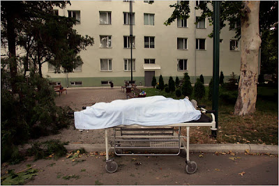
The above pictures are from Georgia and South Ossetia this past week. More pictures at The New York Times here and here. Some of them disturbingly beautiful.

What happened last friday makes me feel sick - will the stupidity never end. Probably not. And while Putin enjoys the possibilty of a fresh little war to keep the minds of his ignorant voters occupied for another decade or so, I am really, really wondering what dreams and hopes president Sakhasvili had last thursday when he send in the troops.? Or rather - what the fuck was he thinking? Naive thoughts of future greatness? This war seem so absurdly meaningless. It's outcome so depressingly predictable.

The only one to benefit from this is Putin and Russia.


By Surrend via Politiken. It's an ad the Danish artgroup Surrend put in the biggest Georgian Newspaper some days ago.

Surrend are great. They've done a number of other artistic interventions like this.

We need more disinformation. Otherwise we go mad.

Georgia Georgia
no peace I find
Just an old sweet song
Keeps Georgia on my mind